
Communication code (+ ai app) for colorblind people, created by Enrico Bisenzi.
After Agenda Digitale amplified my idea by publishing it on https://www.agendadigitale.eu/ cultura-digitale/codice-salva-daltonici-simboli-sui-colori-grazie-a-unapp-con-ai/ and many of my partners expressed interest in implementing it in our joint projects, I decided to submit my idea in English language (thanks DeepL!) to organizations involved in inclusive design solutions for color blindness with the aim to understand it is or not a great idea.

- What is the problem?
- How can the problem be solved in theory?
- What happens in practice?
- A striking example of criticality.
- UPDATE FEBRUARY 2026: Google has introduced symbols!
- An idea for a communication code + app to solve the problem.
- The Claude AI Artifact implementation
- A simple UX solution
- Naming
- Payoff
- Logo
- Graphic set
- Licence
What is the problem?
Eight percent of males and a significantly smaller percentage of females are characterized by some form of color blindness, meaning they cannot perceive red (protanopia), green (deuteranopia), yellow and blue (tritanopia) and, in rarer cases, any color (achromatopsia). Respecting the needs of these people is not only a regulatory obligation for public bodies and many private sectors (including transport and e-commerce) “Color should not be used as the sole visual means of representing information, indicating actions, requesting responses, or as an element of visual distinction.” However, the issue of correct color contrasts has become popular since Italian soccer reversed its decision to adopt an orange ball, showing how not only color-blind people, but many others complained was uable to distinguish it from the green soccer fields!
How can the problem be solved in theory?
When color is assigned a function or informative value, it would be sufficient to associate the color with a model or pattern, or even just a symbol, in order to make the graphics fully accessible to colorblind people, regardless of the colors used!
What happens in practice?
Authoritative sources of information continue to produce graphics that are completely incomprehensible to colorblind people. Even during the Covid epidemic, at a time when communication was of high strategic value, Johns Hopkins University, Il Sole 24 Ore, and many other media outlets persisted in producing ‘graphics’ that were difficult for colorblind people to interpret (not to mention weather forecast graphics).
A striking example of this critical issue
Let’s try using Google Trends to see how the popularity of Milan, Florence, Rome, and Naples has changed over time.
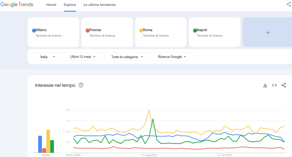
The exclusive association of information with color is striking and brutal: the most problematic colors are used, namely yellow, green, red, and blue!
This makes the graph difficult to interpret for colorblind people, especially those with protanopia and deuteranopia (the most common forms of colorblindness).
Green and red are indeed the most problematic colors for colorblind people, but that does not mean they cannot be used: think of traffic lights, where the equivalent information “GO” or “STOP” is also associated with the vertical positioning of the road sign!
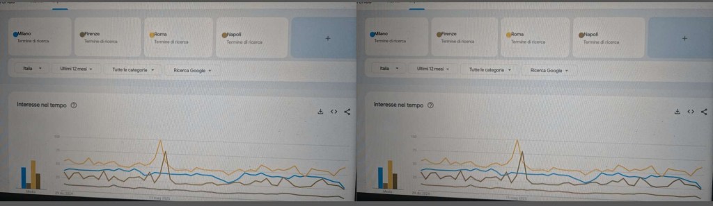
UPDATE FEBRUARY 2026: Google has introduced symbols!
Few days after my publication on the accessibility google groups Google trends has symbols associated to colors!


An idea for a communication code + app to solve the problem
In the first case mentioned above, Google Trends, all you need to do is use a hypothetical app on a smartphone, smartglasses, or CMS (for the web) to label critical color shades with a symbol such as :R: for red, :V: for green, :G: for yellow, and :B: for blue. It is advisable to use the initial letter of the color as a symbol because the choice of color often also has semantic value, for example, red for danger and green for go ahead.

The customization of the app options I have proposed should allow other symbols to be used for other languages, for example :R: :G: :Y: :B: for Red, Green, Yellow, and Blue in English. The same options should make it possible to indicate one’s personal form of color blindness and also the resolution for achromatopsia: in the latter case, different numerical codes should be assigned to each different color shade. It should be noted that the use of :C:O:L:O:R:S: one symbol for each color is only necessary when you understand that you are dealing with graphics with functions or information assigned exclusively to color.
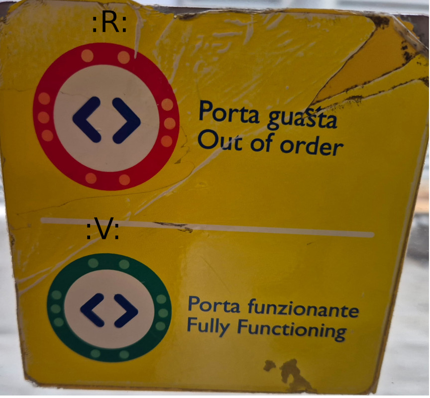
Not only in the digital infosphere but also and above all in real life, certain color choices can affect the daily lives of colorblind people.

Once again, red and green, with their negative and positive connotations respectively, are used here to indicate a critical condition and/or normal functioning. But what about those who have difficulty distinguishing red from green?
In this case too, the use of the :C:O:L:O:R:S: app could be useful, as it teaches us that when the door is closed, the light signal :R: appears, and when it is faulty, the symbol :V: appears (or :R: and :G: if the app is configured for English).
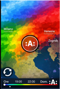
The Claude AI Artifact implementation
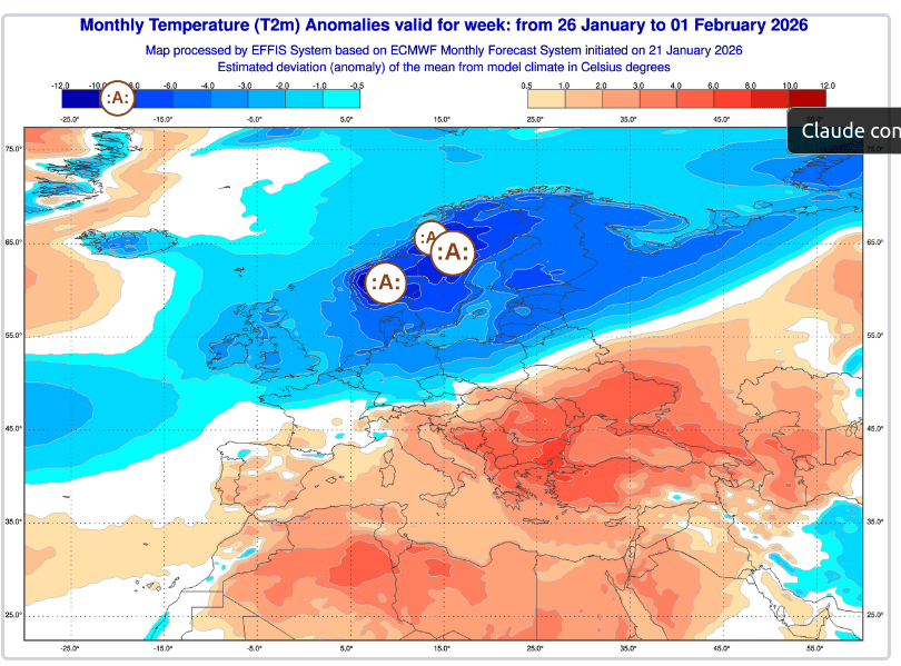
A working web app is now at disposal thanks to Claude.ai artifacts by submitting the following prompt: “Dear Claude, I ask you to design a web app named :C:O:L:O:R:S: with the payoff-description “a symbol for each color”. Why? Eight percent of males and a significantly smaller percentage of females are characterized by some form of color blindness, meaning they cannot perceive red (protanopia), green (deuteranopia), yellow and blue (tritanopia) and, in rarer cases, any color (achromatopsia). How can the problem be solved in theory? When color is assigned a function or informative value, it would be sufficient to associate the color with a model or pattern, or even just a symbol, in order to make the graphics fully accessible to colorblind people, regardless of the colors used! How to solve the problem by a simple UX solution design! Once you have framed an image that is problematic for colorblind people with your smartphone, use the zoom to select each color that carries information and ‘click’ on it inside the circle-viewfinder: as a result of the selection and ‘click’, each area of color with the same chromaticity corresponding to the selection is ‘marked’ with a letter surrounded by the sign : for example :A: or :B: or :C: If I click on the reload sign, I reset the marking and return to the original view. In the image uploaded a weather map with information based exclusively on colors is made accessible to colorblind people thanks to the addition of symbols to the selected color areas. So, can you design for me a web app following the above design idea?”.
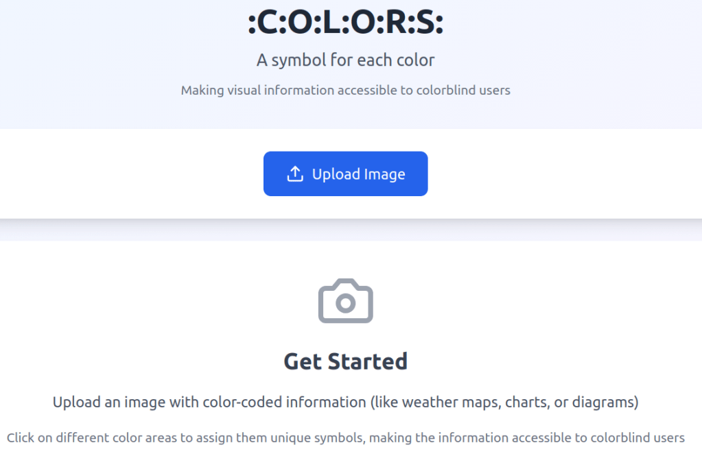
A simple UX solution
Once you have framed an image that is problematic for colorblind people with your smartphone, use the zoom to select each color that carries information and ‘click’ on it inside the circle-viewfinder: as a result of the selection and ‘click’, each area of color with the same chromaticity corresponding to the selection is ‘marked’ with a letter surrounded by the sign : for example :A: or :B: or :C:
If I click on the reload sign, I reset the marking and return to the original view.
We can also imagine applying patterns instead of symbols to mark the informative color areas.
Naming
:C:O:L:O:R:S: which is neither colors nor COLORS nor Colors.
Payoff
“a symbol for every color”
Logo
Graphic set
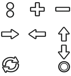
The : sign is to be used as an icon for the hamburger menu. The circle is to be used as a crosshair to identify the informative color to be associated with a CAPITAL LETTER preceded and followed by a colon. The classic reload sign to reset the color indicators. The four directional arrows and the + and – signs that only appear on the app if the end user has indicated in the settings that they suffer from tremors and spasms that can be alleviated by using buttons rather than swiping to move and/or zoom in.
Licence
Solution distributed under a Creative Commons BY-SA-NC license, i.e., with attribution required, distribute.
Author Enrico Bisenzi, ABA teacher in Rome and part-time inclusive designer
